STREAM CHAT
🜲 cmbayani: hey, look, listen!
🜲 cmbayani: here's a tip for you:
🜲 cmbayani: click on the navigation arrows to explore my portfolio, then click on the displayed image to view the specific project! :-) you can also view all my projects by scrolling to the bottom of my page.
🜲 cmbayani: i hope you enjoy your stay~

cmbayani
Going Over My Portfolio :-)
Design Marathon
About cmbayani ☀️
Designer, Artist, Crane Game Expert, Crossword EnjoyerKumusta, I'm Sunny (or Chloe)! 👋In love with the ties between art, people, and technology, I graduated from UCSD in 2023 with a bachelor's in design and interaction and a crazy amount of hours on Splatoon. I'm always chasing after what's colorful, no matter what!
UCSD ESPORTS
Establishing and diligently upholding the identity of UC San Diego's premiere competitive gaming organization.Programs: Photoshop, Illustrator

TRITON GAMING
Designing and creating for an organization of people who play video games, for people who play video games.Programs: Clip Studio Paint, Photoshop

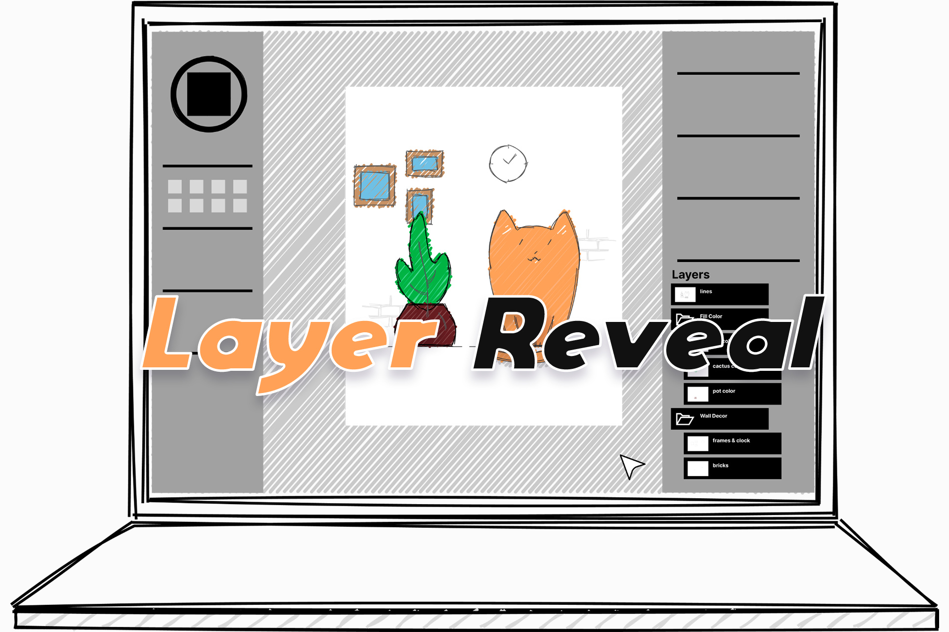
LAYER REVEAL
Dissecting user interaction with layers in art programs and proposing conceptual changes to improve workflow and accessibility.Programs: Figma

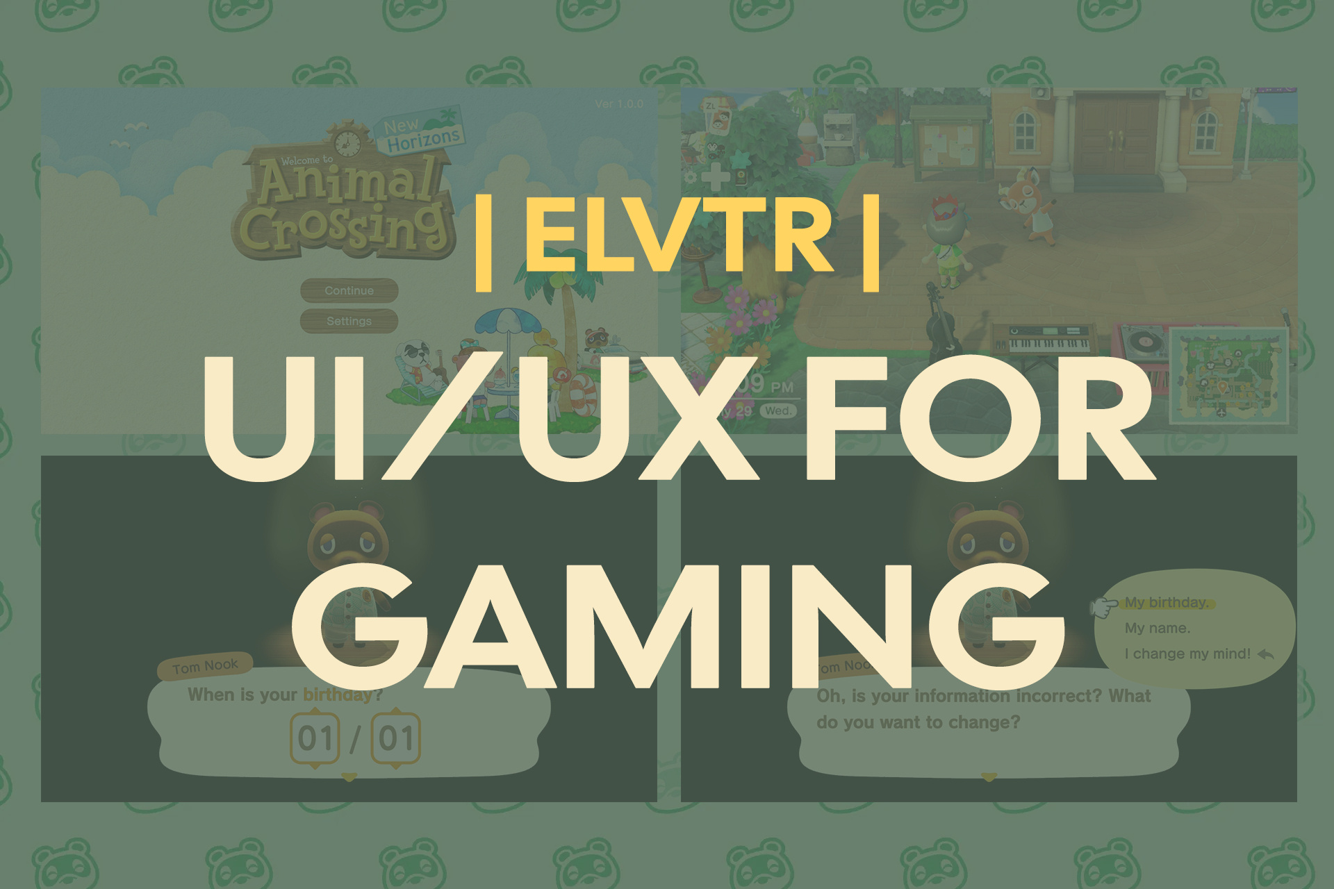
ELVTR UI/UX FOR GAMING COURSEWORK
Work done for ELVTR's UI/UX For Gaming introduction course: a brief case study on interaction limitations in Animal Crossing: New Horizons.Programs: Figma, Photoshop, Maze

ART & PLAY
A personal collection of digital art, made just for fun.Programs: Clip Studio Paint, Photoshop

STREAM CHAT
herring_1: ゆ。。ゆ。。
kaidaRyouma: ♡ ♡
lazulites: 最高にかわいい~~~~~!!!!
oooooizumiiiii: ??
flyingFish111: ♡ww
swordfish12: AYOOOOOOO
FlameSpectral: start!!!!
stingray3: BIG FIGHT TIME

cmbayani
Crossing Animals?
ELVTR Coursework
ELVTR UX/UI For Gaming Coursework
UI Conceptualization and UX Testing • 5 Weeks
OVERVIEW
A brief study of some interaction limitations in Animal Crossing: New Horizons to understand UI/UX practices within a video game design context.
Task: UI Design and UX Testing
Tools: Figma, Photoshop, Maze
CHALLENGES
While the solution itself was simple, the main challenge of this case study was completing all milestones within their short timeframe and a lack of official resources to recreate design-compliant prototypes.
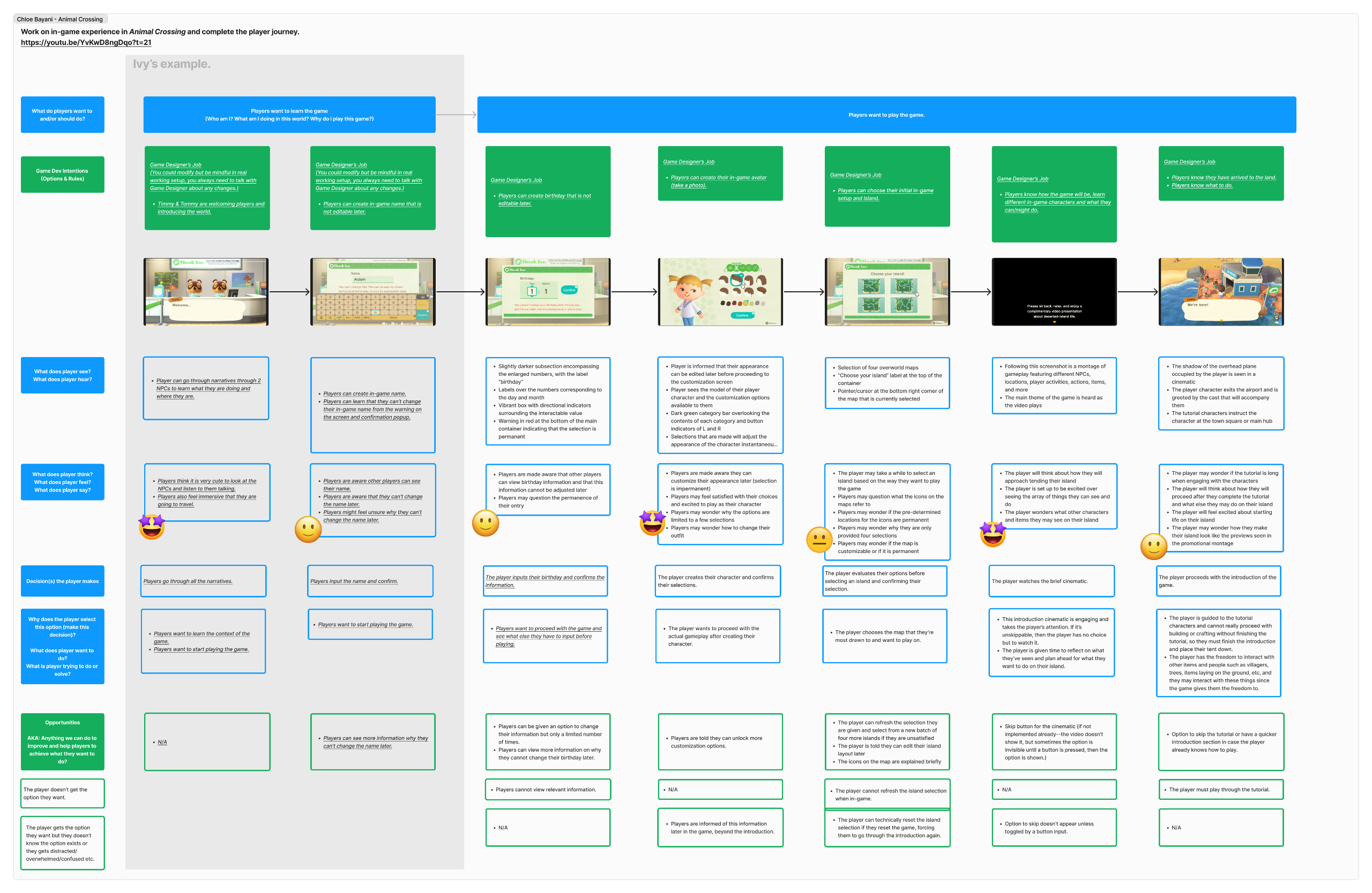
PLAYER JOURNEY
To identify potential interaction limitations, I was tasked with mapping the player's journey for the introduction of the game and creating a paper prototype and flowchart.


ADDRESSING THE PROBLEM
Two options were given for conceptualizing a solution: branch out from an existing workflow or design an entirely new workflow. Understanding that in game design, changes are usually made to existing workflows rather than making new ones entirely, I chose the former to simulate the experience of industry work.
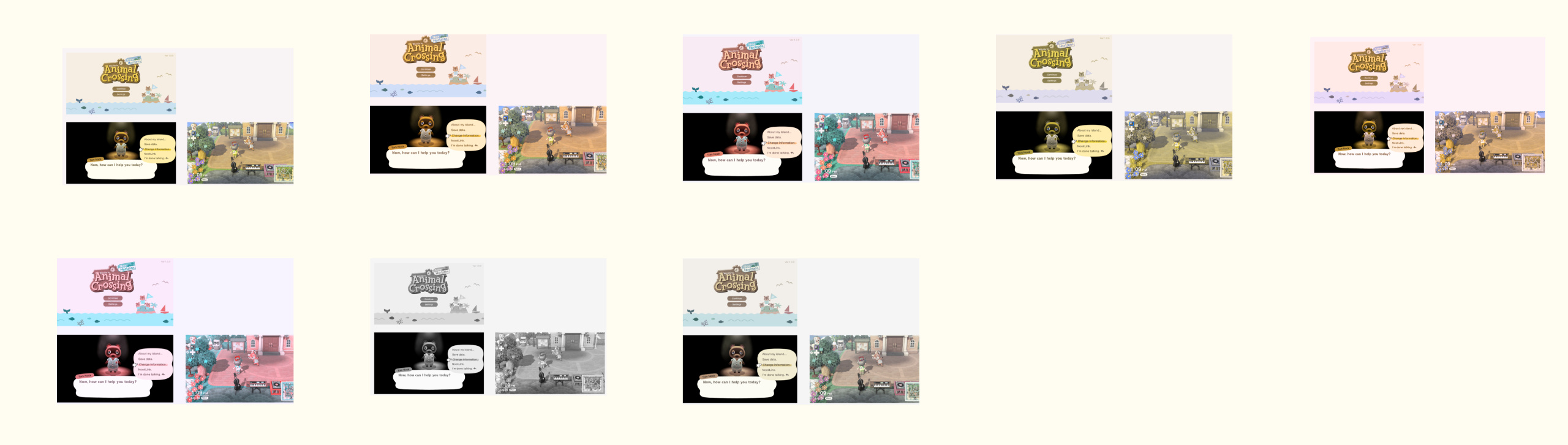
The problem I addressed was the inability to change personal user data (such as birthday) after an in-game profile has been created.A settings option, inspired by the sequence found in previous Animal Crossing games, would provide the means to change personal data.


My initial wireframe sketches were used as a basis for user testing in order to gather more intel for the high-fidelity mock-up.
Keep simplicity and aesthetics intact
Add contrast
Integrate repetition and clarity of purpose regarding the features
MOCK-UPS
Animal Crossing: New Horizons has a very distinct design style that I would have to adhere to in order to create a believable mock-up. I studied gameplay in conjunction with other resources in order to nail shapes, fonts, colors, and other important aspects of the game's visual identity.
After establishing a style guide, I created a possible sequence that allows for the changing of sensitive data. The first two images depict newly added "settings" options from which the sequence can be accessed.In addition, a color blindness test was conducted in order to emphasize the importance of user accessibility.


OUTCOMES
Gained a deeper understanding of the process behind user testing within a game design context
Further understood how to adhere to design specifications for an existing brand and creating realistic additions to a workflow
CLOSING THOUGHTS
Although My time with ELVTR and the instructor, Ivy Sang, was incredibly brief, this was one of my first experiences working under and alongside a UI/UX designer within a game design context, and I am grateful that I had the opportunity to experience industry-style work outside of formal academics.
STREAM CHAT
herring_1: ゆ。。ゆ。。
kaidaRyouma: ♡ ♡
lazulites: 最高にかわいい~~~~~!!!!
oooooizumiiiii: ??
flyingFish111: ♡ww
swordfish12: AYOOOOOOO
FlameSpectral: start!!!!
stingray3: BIG FIGHT TIME

cmbayani
"Find" the Solution!
Layer Reveal
Layer Reveal: Improving Workflow in Digital Art Programs
UC San Diego DSGN 118: Design Creativity • 4 Weeks • Image and Vector Graphics
OVERVIEW
The capstone project of UC San Diego's DSGN 118 course: addressing a persisting design limitation that compromises accessibility, conceptualizing a solution that does not yet exist, then prototyping said solution.Our project, Layer Reveal, addresses the current limitations of layer management in digital design applications.
Task: UI Design and UX Testing
Tools: Figma
Team Members: Chloe Bayani, Isabelle Chyun, Eunice Lee, Tony Meng, Grace Zheng
PROBLEM SPACE
In terms of design applications, "layers" are parts in a composition that can be stacked and manipulated independently. In researching pre-existing representations of layers in such applications, we found that they limit digital artists’ creativity and productivity in their flow of producing artwork, because:
It’s difficult to find specific layers
It’s difficult to reorder many layers
It’s difficult to keep layers organized

INSIGHTS

Collecting user feedback on current representations of layer lists clarified where the limitations stemmed from, and where we should focus our approach.
Too Much Information — Layer list shows all layers in the entire canvas, when a user may be trying to isolate a layer, demanding extensive searching
Difficult to Parse — Due to the minimal information about the content in each layer
Cluttered information and indistinguishable layers mostly affect non-seeing artists, who rely on TTS tools and get overwhelmed with information they cannot parse effectively.
IDEATION
All solutions stem from ideas, so we first compiled possible solutions together and grouped them by similarity.
We settled for a solution that did not compromise on any features we wanted to implement and narrowed down our ideas.
Secondly, we created a development plan to split up tasks and ensure our deliverables were ready before each deadline,
which streamlined our operation.


WIREFRAMING

The idea we settled on is called "Layer Reveal". The idea behind Layer Reveal is to organize information presented to the user according to location-sensitive interaction.Small bits of information would be made available at a time, and this information would be accessible without navigating large, cluttered collections of data.
Layer list displays only objects that are located under a cursor
Layer list appears at the cursor when something is clicked, providing an instant toolbar


FINAL PROTOTYPE
In our final prototype, we created formal menu options, icons, a dynamic toolbar, and other components in order to express our demonstration in a tangible way.Iconography, hierarchy indents, and location-sensitive windows assist with visibility.Here is a link to our final demo.


COMPARISON
Traditional Workflow
Time-consuming and difficult
Interrupts user’s current workflow
Delayed feedback
Error-prone
Layer Reveal Demonstration
Provides “reverse search” according to the canvas to find specific layers
Allows quick reordering by limiting information to just relevant layers
Represents the hierarchy as bounding boxes, which are easier to recognize and organize than a layer list
Layer Reveal offers a novel representation of layers by implementing a just-in-time, versatile, and customizable layer search and reordering interface,
which is lacked by current image editing tools for digital artists.
FUTURE STEPS
Our solution is not perfect, however. We identified some constraints in our approach and other possible ideas to implement.
Areas of Improvement
Effectiveness of layer reveal on hidden layers
Decreasing risk of errors (e.g. accidentally reordering hidden layers, moreso when hierarchy is disabled)
Next Steps
Area Selection — Users can use selection tools to easily distinguish layers and apply edits to layers over a large area
Layer Fix — Automatically detects layer errors and suggests fixes
OUTCOMES
Gained a deeper understanding of the process behind wireframing and prototyping
Gained insight into designing solutions centered around accessibility
Learned how to work within a short time limit
Further understood how to apply UX/UI practices in a context of designing for pre-existing systems
CLOSING THOUGHTS
This project was a great exercise for me to understand conceptualizing solutions to interaction limitations and implementing them.
I would love to revisit this in the future with more time for further development of the hi-fi prototype and more thorough user testing.
STREAM CHAT
herring_1: ゆ。。ゆ。。
kaidaRyouma: ♡ ♡
lazulites: 最高にかわいい~~~~~!!!!
oooooizumiiiii: ??
flyingFish111: ♡ww
swordfish12: AYOOOOOOO
FlameSpectral: start!!!!
stingray3: BIG FIGHT TIME

cmbayani
Work or Play? I prefer...
Personal Work
Personal Work
Graphic Design, IllustrationMy creative journey started with digital art (i.e. fanart for games I play), and I've been steadily curating this skill. Though my tools have evolved from mouse to tablet, my love for drawing has refused to dampen.I'm by no means a professional, but I'm proud to manage a small following on social media, make merchandise, take commissions, table at conventions and artist alleys, and run a small business surrounding my art in my spare time. Here's a sneak peek of illustrations I've made recently!


STREAM CHAT
herring_1: ゆ。。ゆ。。
kaidaRyouma: ♡ ♡
lazulites: 最高にかわいい~~~~~!!!!
oooooizumiiiii: ??
flyingFish111: ♡ww
swordfish12: AYOOOOOOO
FlameSpectral: start!!!!
stingray3: BIG FIGHT TIME
cmbayani
LET'S GO TRITONS!!!!
Triton Gaming Work
Triton Gaming
Creative Lead, Graphic Designer, IllustratorTriton Gaming is UC San Diego's gaming organization that promotes and leads various events on campus, the most notable being Triton Gaming Expo held once every year.As a creative lead, I was in charge of holding workshops and taking up heavy creative tasks, such as redesigning the mascot and branding identity, creating merch designs, and more. TG was my very first introduction to working with a large organization, leading groups, and opening up to people, and I took away more growth as a person than as just a designer.


STREAM CHAT
herring_1: ゆ。。ゆ。。
kaidaRyouma: ♡ ♡
lazulites: 最高にかわいい~~~~~!!!!
oooooizumiiiii: ??
flyingFish111: ♡ww
swordfish12: AYOOOOOOO
FlameSpectral: start!!!!
stingray3: BIG FIGHT TIME

cmbayani
LET'S GO TRITONS!!!!
UCSD Esports Work
UCSD Esports
Creative Director, Varsity PlayerUCSD Esports is UC San Diego's premiere competitive esports organization. As creative director, my responsibilities included not only creating various assets, but also making critical design and leadership choices regarding the development of the creative team and the branding of the organization, from social media posts to the jerseys the players wear. I accomplished so much—from learning to work with sponsors and players to maintaining professionalism and improving my design skills in a fast-paced setting. Although my time as creative director was only for a year, I owe a lot of professional-level growth to my experience with UCSD Esports.


.

MeetMe
MeetMe
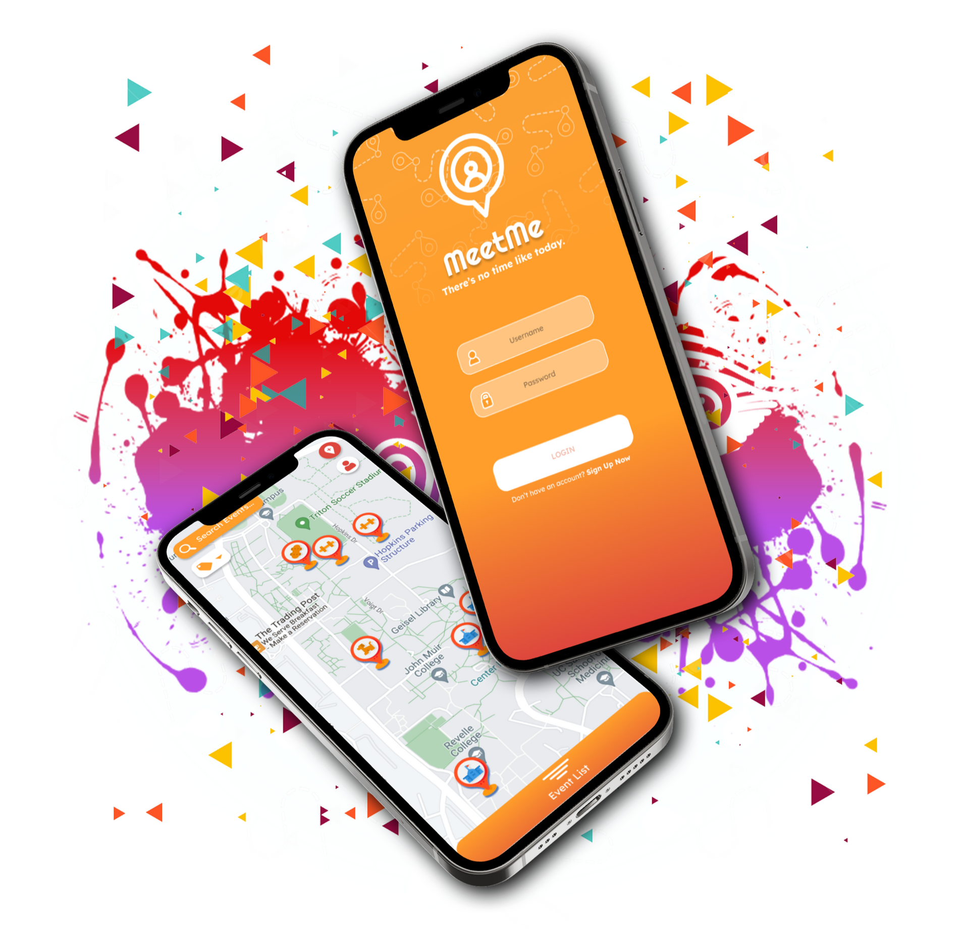
When a friend cancels on you at the very last minute, it can be hard to quickly find a plus one to accompany you to an event—this was a problem my team identified while we were studying social computing and systems at UCSD. In our quest for finding answers, we conceptualized the idea of an application that could connect you with local people interested in meeting up spontaneously, which would eliminate the process of finding a substitute. We ended up creating “MeetMe” based on that idea, and we further developed the application through a series of prototypes to explore how meeting people in-person could be made easier, quicker, and more casual than existing meet-up applications.
Pitch
Whether you're a solo-rider in need of a plus one to a concert, seeking companionship after a friend flakes on plans, or just looking for something fun to do when all your buddies are unavailable, there will come moments in which social events don't (or seem like they won't) go as planned at the very last second. But you can't let all that time go to waste! So what better solution than an instantaneous one—a solution that involves likeminded people joining you on a whim without the hassle of planning?No virtual experience can truly replace the impact of face-to-face, in-person interaction. Our app MeetMe—a social platform that facilitates in-person meetups with a target audience towards college students— focuses on supporting spontaneous meetups between people so they can meet no later than "today". Through MeetMe, our goals encompass the value of authentic shared interactions and aim to augment the current meetup-app experience by eliminating the need for long, preemptive planning to instead focus on what can be accomplished quickly if users were to interact right away.MeetMe's development also focused on potential solutions to a few personable social situations:
- A way for people with little to no friends or support system to connect and interact with others immediately
- To encourage friendly and casual meet-ups through a social app without expectation of service or romance (e.g. Facebook Marketplace, Tinder, etc.)


First Prototype
Our first prototype that we did was a paper prototype in which we came together and decided to simulate how our design would work in real life. The classroom we demonstrated our prototype mimicked the Map + Search function: in our app, it would be the map of all the events displayed to the user.For our map interface, we created a Google Site with an embed of a Proxi map that included a pinning function and event creator. Students visited the site and could create their own events or join pre-existing ones we created by signing up through a Google Form included in the Proxi map pins.We used colored construction paper signs as placeholders for the events including information about what the event was, where it was located, and how many participants were needed for the event to take place. We then placed them around the prototyping classroom for people to peruse, choose whatever "event" interested them, and physically go to the paper (essentially joining the lobby) to begin doing the activity (ex: writing a poem or drawing on the whiteboard).
Initial Response
After evaluating the survey results post-prototyping session, our data reflected that participants enjoyed or were indifferent to creating events and those who hosted their own events rated their experience better overall. Despite our initial prototype being a little unfriendly towards those who wanted to host their own events due to the nature of how we constructed it, this was a demonstration of how users who took initiative were more likely to engage in a social setting with the same aptitude. As a result of this, we wanted to look into streamlining the event creation process for our next design iteration.
Players also found the event tags helpful, which we aimed to highlight more in our final prototype. Event tags ended up being a big factor in how users found their events, and also helped us determine what events were most popular amongst our users (casual events).Overall, participants confirmed that the experience is positive and they'd like to see a product like MeetMe. However, participants have reservations about meeting strangers outside of their college campus; such concerns, however valid, would go unaddressed for the sake of this first prototype.


Second Prototype
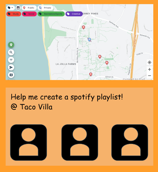
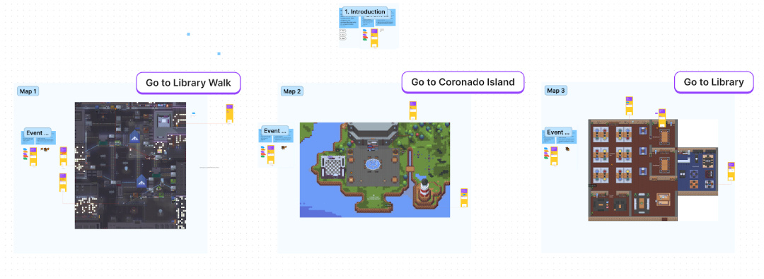
Forgoing our initial concept of doing a live presentation in which participants would have to physically move around the prototyping classroom, we simulated our second prototype in Gathertown with the idea of using it as a representation of the real world. To simulate the map UI, we created a map in Figma and 3 Gathertowns to represent a "campus". Participants could find events by location by looking at pinned events on the map or create their own and pin it on the map.
The event sticker on Figjam would allow participants to fill in the name, description, location and time of their event, as well as create a lobby with their desired max amount of people.The event stickers each also had a chat feature for participants to use and communicate with eachother, to coordinate meetups or talk whenever they wanted. This was a feature that was requested through feedback from our previous prototype and we were able to implement it through Figjam's chat function.
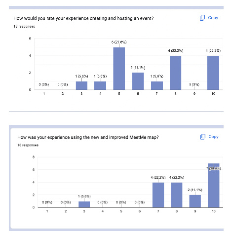
User Feedback
Overall, the new map was an improvement. The UI allowed for a much easier way for participants to create and join events, and find events in locations they wanted to explore. However, users preferred joining events rather than creating this time. Due to the nature of Gathertown, it was easier for participants to look on the in-game map to find users, and many users were preoccupied with other events, so some event creators did not have anyone join their party.Some key feedback we received was that our execution was still flawed in that it relied on real life interaction to convey our goal of bridging online interaction with meeting up face to face. This would be hard to execute in a simulation like Gathertown and would look much different if actually implemented beyond just a prototype.
Hi-fi Mockup
After reviewing the strengths and weaknesses of our first and second prototypes, we took note of what garnered the response we wanted. In this case, what appealed to users to make them want to create events, and what made them want to join events. What we learned from the first prototype was that users were more likely to create events if it was easy and simple to do so. What we learned from the second prototype was that users were more likely to join events if they could see a wide overview of the map with little restriction and noticeable cues.We took great inspiration from using Proxi, the application we piggybacked off of in our first prototype, and modified its design slightly in Figma to create a clean map for the main event viewing page. We also took inspiration from our second prototype's Figjam with the pins, and gave the location markers a more colorful, attention-grabbing look. The filter, search, and other tabs are not occlusive to the vision of the user, and it is easy to create a custom event (no hassle of dragging the Figjam stickers over the maps). This mock-up is what we originally envisioned for MeetMe, but, because of piggybacking constraints, were unable to implement effectively.


Challenges & Reflections
MeetMe was created with the intention of catering primarily to college students during our brainstorming process, specifically those who do not already have a dedicated social support system or friend group. Because of this, MeetMe has a limited target audience, and while there may be appeal to socially adventurous users, there is a possible lack of incentive for them to use MeetMe if they already belong to a student organization or active friend group. We thought a lot about MeetMe being expanded towards a general population and to include other topics of interest such as traveling or networking, though it seemed much too broad and ambitious.In addition, during our prototyping sessions and resulting feedback collection, our data showed that users were most interested in casual social events rather than the other options that were provided (networking, educational reasons like studying together, creative purposes etc.). While this outcome prevents MeetMe from possibly expanding into other realms to include those interested in other avenues, it also aligns with our intention of fastening MeetMe to be an app that facilitates easy social interaction. The smoothness and success of our prototyping sessions can attest to this; once everyone overcame the initial awkwardness of suddenly getting up to move around and speak or play games, the room became lively and it was enjoyable to watch the core idea of MeetMe come to life (albeit on a smaller scale).In real execution outside of the classroom, there are also safety risks that come with any social app, especially ones that lead to an in-person meeting, that we anticipate during the use of MeetMe. This includes various safety concerns in regards to meeting a stranger in an enclosed or private space (for the female demographic especially). We believe in the integrity of our users, but we also believe in their safety; we learned that many of potential users felt the same way through our assessments, and we discussed how to approach this social complication. After evaluating our user surveys and consulting with possible changes to our design systems, some solutions that may combat these concerns includes the implementation of a feedback, report, and/or user verification system.There exist various tradeoffs being made with regards to our target audience, scope of environment, and potential events, but we learned a lot about the design process of a successful social application and how to encourage our peers to interact with one another in person after "meeting" online. The barrier between online and in-person interaction is very thin when probed and wound together, and the experience of creating MeetMe was one we hoped demonstrate that observation.
.
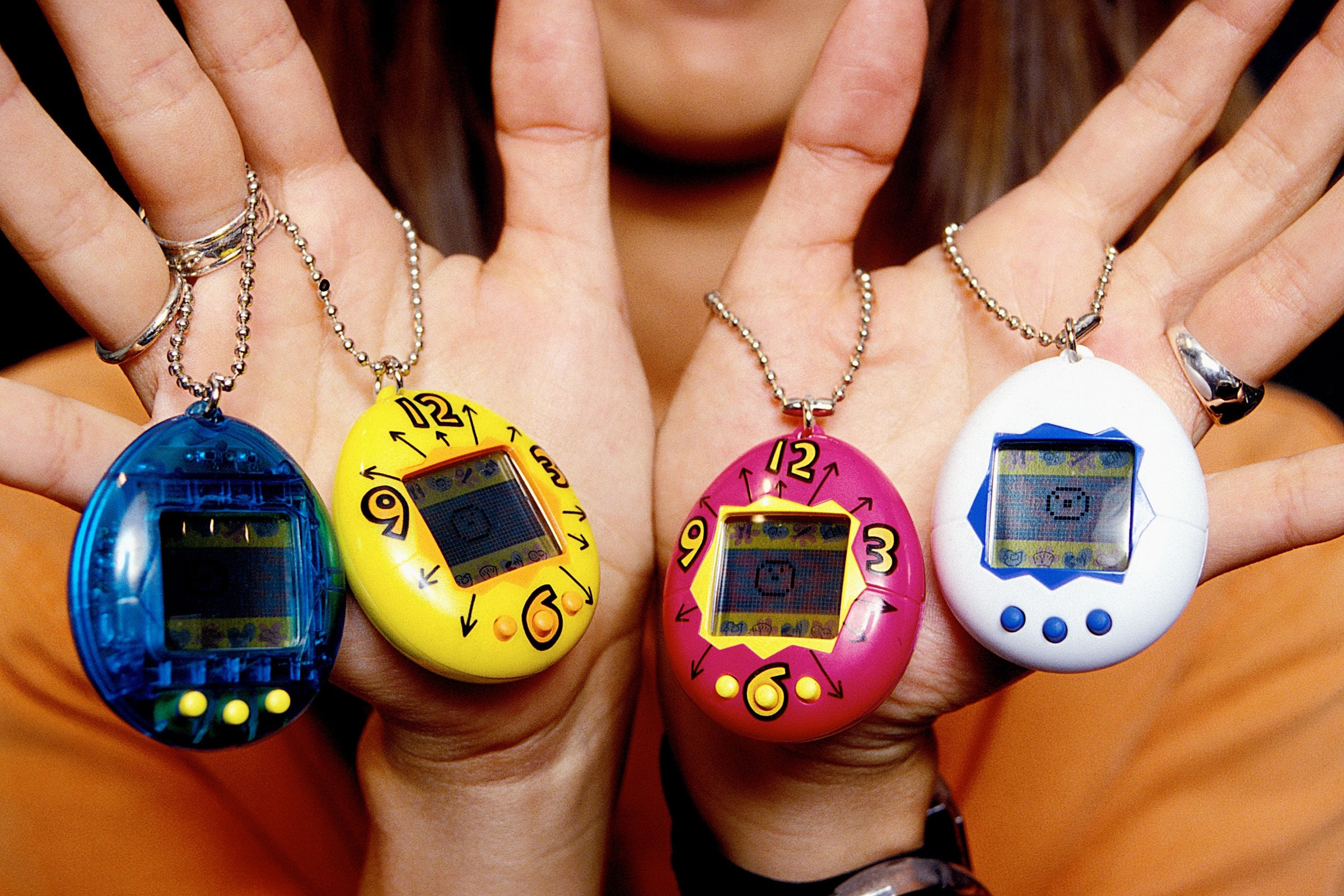
Tamawatchi

As an avid fan of mobile games and digital pets, I was surprised to find out that the Apple Watch—a small, portable, digital interface—lacked a game of that variety. With the goal of creating something that embodied the spirit of the pet game genre, I took up this concept as a challenge to explore cross-platform design, and to design for smaller interfaces since I usually prototype for bigger screens like that of a smartphone or desktop computer. The end product, “Tamawatchi”, was the culmination of my love for digital pets and the effort to understand how interfaces and applications adapt to different devices.
Background & Motivation
Translating applications across platforms is a design challenge for all, especially if the platforms shift in size drastically. Whether it be creating multiple iterations for an application so that it can be downloaded on other platforms or creating something that can be compatible with older devices, such an application must retain its core function and message despite almost all of its capabilities facing reduction in size and possibly performance.This observation can be applied to something like a smart watch; when comparing the iMessage application on the smart watch compared to its iteration on a phone, the way the user interacts with the application due to its affordances; the manner the application responds; and how efficient the tasks are completed all face discrepancies in performance, but still manage to communicate the same goal. I was intrigued by this. The smart watch offers so little, but the application on it still functions as intended.Thus arose my question: how can an application for something such as a smartwatch be developed so that it achieves its purpose without sacrificing the bulk of what it offers on other platforms? And to what extent can an application with many features be converted over to a platform that has less affordances for it to function?When I think of "simple yet complicated" applications, my mind immediately drifts to "video games". Despite performing somewhat differently, games rely on the same few methods of input; be it joysticks, touch, or buttons. If one or more degrees of interaction were taken away, however, like if the game were to be ported onto a device like the smart watch, how could a video game continue to function in a manner that is both user friendly and intuitive to the system its designed on?
Ideation
As mentioned, this project arose out of a general passion for video games, the lack of games on the Apple watch app store, and the hope to learn something new about user interface design by designing an application for the smart watch. But video games, as a genre of application, is incredibly broad in on itself—from simple platformers to 3D online shooters, I had to size down and commit myself to something that can function effectively on a small device all the while relying on limited degrees of interaction, and something that had significance to it being on a smart watch. After all, playing something as attention and input demanding as a competitive RTS game would lose value and effectiveness on your wrist compared to a computer. Again, the goal was to make an application that could preserve a similar function and performance despite the cross-platform design. The game I chose had to be simple enough to maintain its identity on a smart watch yet entertaining enough to be played, something that wasn't entirely time-consuming and wouldn't abridge the core purpose of the device it's run on.I struggled to think of how to further approach my questions for a while when suddenly, on an impromptu Target run, I came across a number of new generation Tamagotchi devices for sale—and I was immediately struck with inspiration. I've always had a love for digital pet games for their simplicity and "put down and pick up later" playstyle in that you could progress through the game even if you checked in periodically for just a few minutes, and I felt that this would be a perfect fit to translate into a smart watch device. Not only that, but Tamagotchi themselves are housed on a small device with a screen that's very alike to the size of an Apple Watch's, and utilize only three buttons as mode of input.Now that I knew what to base my application off of, I needed to start thinking about what it might look like.


Drafts & Lo-fi Mockup
During this stage, I planned out what the UI would look like and began thinking about which parts would respond to the type of input received. There was a lot of function mapping across different iterations exploring which method would be most effective.There are also a few concept drafts for digital pets.


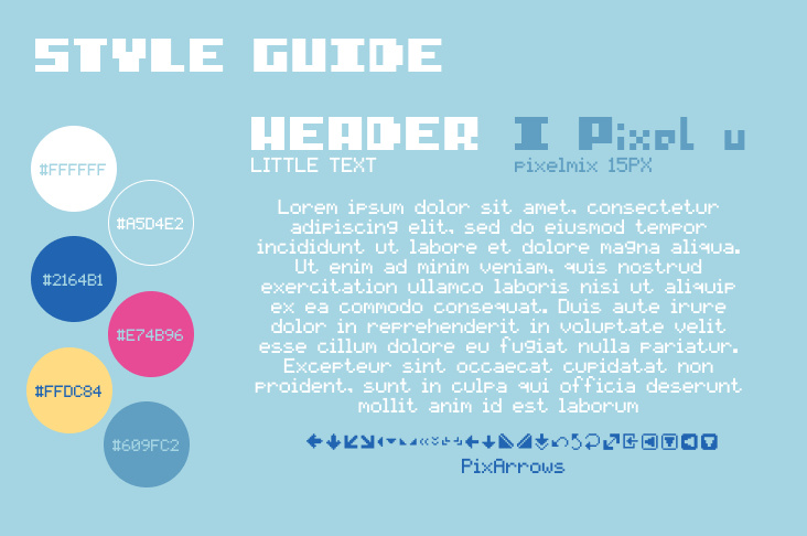
I began introducing color to my application and created a moodboard and style guide. I drew lots of inspiration from the design of vintage Tamagotchi.Transitioning from the lo-fi to the hi-fi mockup of Tamawatchi was somewhat of a challenge, as I would often make the UI too ambitious or unsuitable for a small screen because up until this point, I have only ever done prototypes for devices sized like a phone or larger.
Hi-fi Mockup
After I was satisfied with the first iteration, I applied my findings from my experience of creating the lo-fi mockup and began creating the hi-fi prototype.At this point, I also began implementing design choices that would make the prototype feel more "realistic"--I added transition screens, popups, animations, and finalized designs of art that would appear in the game.

Challenges & Reflections
Tamawatchi was created with the goal of bridging the smart watch with its Apple device cousins through an unhindered design that could communicate and compete effectively with the latter devices. Unlike other applications on the smart watch, I wanted to achieve creating an application that would not need to sacrifice components of its design in order to function the same as it would on another platform. I found that I somewhat achieved this goal; Tamawatchi lives up to what I envisioned, but it is merely a design concept, and I have no idea what it would be like to interact with it if it were actually implemented.The biggest challenge for this project was, again, shifting my perspective to think smaller. I was very used to designing prototypes for websites and larger applications, so thinking about small interfaces was very different for me. In the end, I learned a lot about cross platform design, how devices and iterations of applications across them interact with each other.I am currently revisiting this application and I hope to actually develop it beyond prototyping frames in Figma, though that will require learning some coding on my end, which I will challenge myself to do.
.